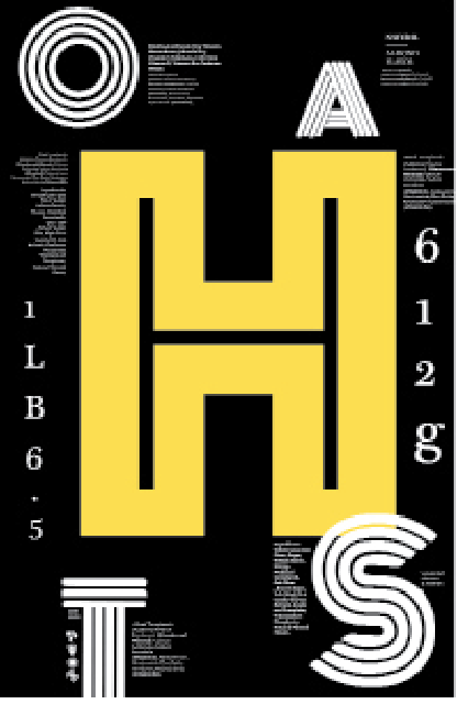
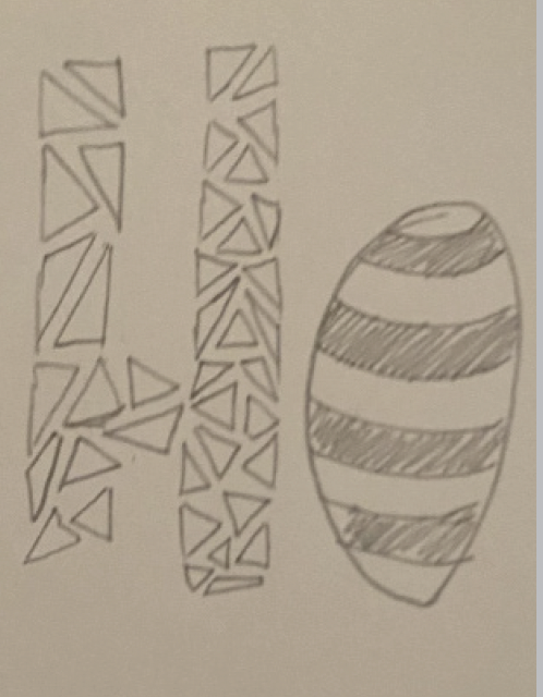
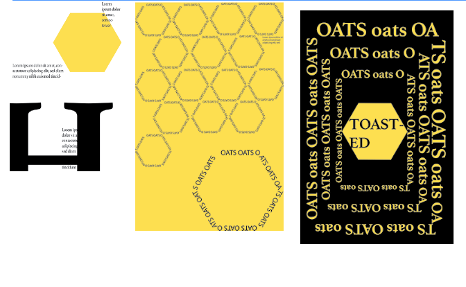
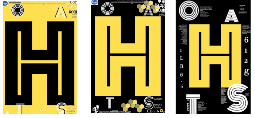
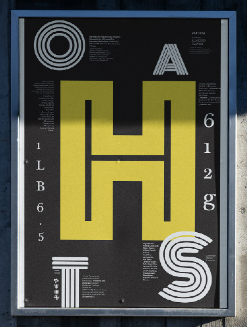
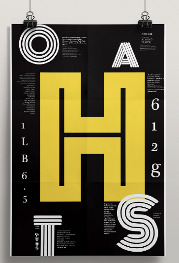
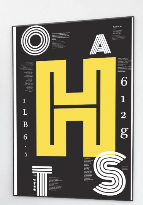
The goal of this typographic poster was to recreate a cereal box design
by re-interpreting the information of the box to create a visual and
well structured covered design. Taking into consideration the hierarchy,
spacing, legibility, readability of the box to capture the viewer’s eye
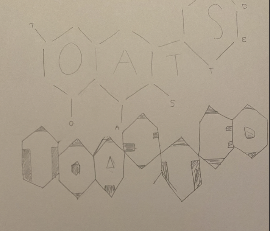
and successfully deconstructing and re-interpreting the information of
the cereal box.
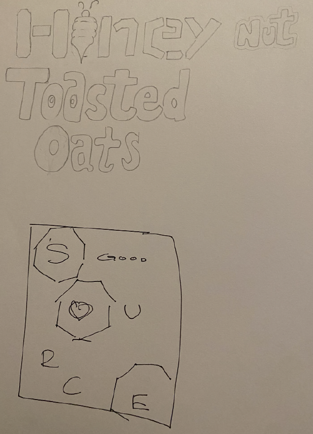
The cereal that I chose is called Honey Nut Toasted Oats (another version of healthy Cheerios). I decided to go this route, because it has a lot of imagery, I wanted a challenge to create and reinterpret the information on the box to emphasize and illustrate the information, recreating the design on the front of the box. The typography used a lot of different fonts and various weights—it was readable but the original design was more focused on imagery than the main title.